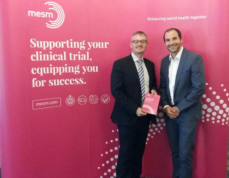
May 2016 is an exciting time for MESM as we proudly launch a rebrand of the business. The goal with this rebrand was to ensure we present MESM in a way that reflects the growth we’ve seen over the last few years and our ambition for the future.
The biggest changes you’ll notice first are to our logo, colours and fonts, which have been updated across our website and all our printed materials. We’ve also changed our website address from mesmglobal.com to mesm.com – a simpler, more memorable URL. (Don’t worry, if you type in the old address you’ll still land on our website.)
We wanted our external presentation to reflect the level of expertise and capability that we’re known for amongst our customers and partners – we hope the new style will be distinctive and memorable, and will help MESM stand out from the crowd.
Why does branding matter?
Your company’s ‘brand’ can be thought of as how you present and talk about your business – it tells customers who you are, what you stand for and what it says about them if they choose you as a partner. Branding isn’t just about logos and colours; it’s how you’re perceived and your reputation in the industry.
We know that proactively thinking about branding and presentation is essential. We need to make sure our branding always reflects who we really are as a business, which is why we felt an update was due for MESM.
Our customers know that we can support trials anywhere in the world, solve any and all equipment supply problems and service even the largest clinical trials. But our branding didn’t necessarily reflect our capabilities and scale.
"It's crucial for any businesses to regularly review their branding to ensure it accurately reflects both their historical competencies and where they are heading. We felt MESM had reached a moment where an updated look and feel would help us move the business forward, and we’re really happy with how our new branding has come together.”
Jonathan Raven, Commercial Director
Logo, colours and fonts
We explored a range of options for an updated logo – we wanted an emblem that suggested our global reach and unrivalled levels of service and efficiency. We also wanted to bring out the human side of our business, which our customers and partners so often cite as one of the elements that sets us apart.
The logo we developed helps us express all the things that make MESM what it is – a business that doesn’t just supply all your clinical trials equipment and consumables across the globe, but which also offers expert consultation, thought leadership and knowledge.

The new colour palette seeks to move away from the typical light blue shades of the medical industries, to something that will cut through the noise and stick in customers’ minds. We wanted colours and fonts that were bold, refreshing and visually appealing. What we chose offers versatility in how we present different resources and materials for customers, while always being recognisable as MESM.
"MESM have taken brave decisions throughout the process. They came with an open mind and desire to create a brand that reflects not only today's MESM but also the company they want to be in 10 years’ time.”
Ken Dixon, Head of Strategy at Uniform
(our creative partners for this project):
Looking to the future
We hope our existing customers enjoy our new look and feel, and that it only serves to enrich the experience of working with us. We also look forward to a future building new relationships across the clinical trials industry globally – enhancing world health together.

David Parry, Managing Director & Jonathan Raven, Commercial Director
